
Consider the building you’re sitting in. Someone—likely an architect—spent just as much time thinking about its design as they did about its structural integrity. Now theoretically, web designers ought to operate along this same line of logic. But since the web is a comparatively more forgiving medium, designers can make changes to a website without worrying if it will all collapse into rubble. This enables us to design for the web without being fully aware of all of its constraints and limitations. And although it’s not critical for a design to be perfect on the first attempt (ship first, then iterate, right?), there are still costs associated with reworking a website. Often, those result in projects being behind schedule and over budget.
Understanding the basics of web as a medium can help guide us from an idea to a finished website faster—and with fewer mistakes. When we’re familiar with the technical details of how the browser renders elements on a page, we can make more informed decisions earlier in the design process. Knowing what’s possible (or impossible) and which way is easier and faster to implement can significantly reduce time spent reworking and make developer handoffs happen more smoothly.
One of the most basic but integral concepts in designing for the web is the box model. In this post, we explore how the box model works and how it’s implemented in CSS.
What is the box model?
Every HTML element is, at its most basic form, a box. The box model is used to describe an element’s dimensions and structure. It is made up of four boxes: content box, padding box, border box, and margin box.
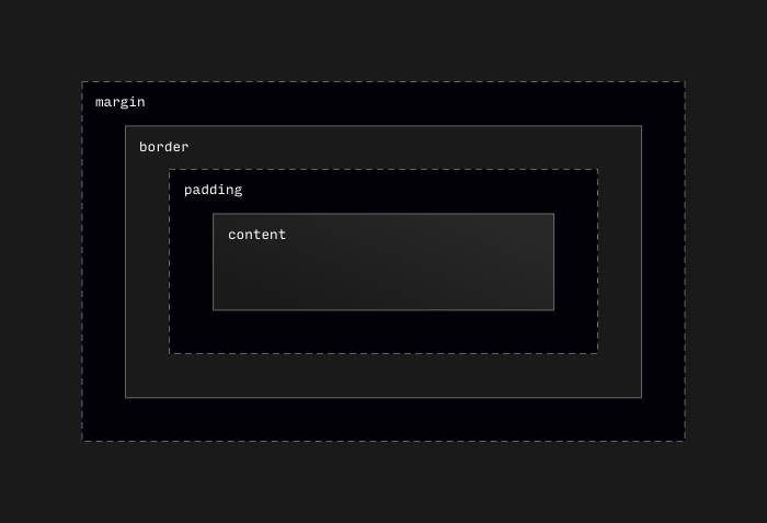
Let’s take a closer look at each part of the box model and how they contribute to an element’s overall size.
Content
The content box is the inner-most property of the box model. It is defined by the height and width properties in CSS. By default, the content box is defined by whatever is inside the element. It will expand and contract depending on its content.

The content box can be constrained by setting dimensions on an element.
.fixed-size-box {
  height: 200px;
  width: 300px;
}
Note: In this example, .fixed-size-box has a fixed height. It is often best to not give an element a fixed height whenever possible. This allows layouts to be flexible to fit content of different sizes.
Percentage units can be used to create flexible elements based on the size of the parent element. Lower and upper limits can then be defined using min- and max- properties.
.flexible-box {
  width: 100%;
  max-width: 600px;
}
Padding and margin
Padding and margin are the most easily confused parts of the box model. Here’s a simplified comparison between the two:
| Padding Box | |
|---|---|
| Positioning | Outside the content box |
| Background Behavior | Shares background with content box |
| Layout Behavior | Doesn’t overlap |
In CSS, padding can be defined using the padding property. Margin is similarly defined using the margin property.
Here’s an example of how to use them in CSS:
.box-1 {
  /* Adds a 1rem to all sides. */
  padding: 1rem;
  margin: 1rem;
}

.box-2 {
  /* Adds a 1rem to the top and bottom, and 0.5rem to the left and right. */
  padding: 1rem 0.5rem;
  margin: 1rem 0.5rem;
}
.box-3 {
  /* Adds a 1rem to the top and 0.75rem to the right, 0.5rem to the bottom,
   * and 0.25rem to the left. The order is counter-clockwise, starting with the
   * top and ending with the left side.
   */
  padding: 1rem 0.75rem 0.5rem 0.25rem;
  margin: 1rem 0.75rem 0.5rem 0.25rem;
}
Padding and margin values can also be defined with side-specific properties, as opposed to the shorthand used in this example. Sometimes this can be easier to read because it’s clear which value corresponds to which side of the element. It’s also useful for when only one side of an element requires padding or margin.
Here’s .box-3 from the previous example refactored to use side-specific properties:
.box-3 {
  padding-top: 1rem;
  padding-right: 0.75rem;
  padding-bottom: 0.5rem;
  padding-left: 0.25rem;
  margin-top: 1rem;
  margin-right: 0.75rem;
  margin-bottom: 0.5rem;
  margin-left: 0.25rem;
}
Border
The border sits between the padding and the margin. Although a border is seemingly similar to those, the CSS for applying a border is slightly different, there needs to be width, stroke, and color.
.box-1 {
  /* defines a thin red border on all sides */
  border: 1px solid red;
}
.box-2 {
  /* defines a red top border, blue right border, yellow bottom border, and green left border. */
  border-top: 1px solid red;
  border-right: 1px solid blue;
  border-bottom: 1px solid yellow;
  border-left: 1px solid green;
}
An important difference to note in this example: if each side’s border is unique, we cannot add more values to the border property as was shown in the padding and margin example. We must use the side-specific properties to specify a unique border for each side of the element.
Box sizing
In the section on content, we learned that the content box is defined using width and height properties. So if we want a box with ten pixels of padding and a border of two pixels and a total width of 300 pixels, we need to account for the added width from the padding and border when we define the content width.
We can use these formulas to get an element’s total size:
totalWidth = width + (padding-left + padding-right) + (border-left-width + border-right-width)

totalHeight = height + (padding-top + padding-bottom) + (border-top-width + border-bottom-width)
And we can apply a refactored version of this formula in CSS using calc() to make sure the content, padding, and border are all contained to a width of 300 pixels:
.box {
  /* contentWith = totalWidth - 2 * padding - 2 * border-width */
  width: calc(300px - 2 * 10px - 2 * 2px);
  padding: 0 10px;
  border: 2px solid blue;
}
This can be frustrating, especially if we need to adjust the padding on an element. In order to make this easier, we can use the box-sizing property to change which box the height and width properties are applied to. This way, we don’t have to calculate the width of our element. In this example, width is applied to the border box, and lets the content box shrink to the fill the remaining space, once the border and padding are added:
.box {
  box-sizing: border-box;
  width: 300px;
  padding: 10px;
  border: 2px solid blue;
}
It is often the case that border-box is the preferred box sizing. Instead of setting box-sizing: border-box individually on each element, these CSS rules will set box sizing for all elements:
:root {
  box-sizing: border-box;
}
*,
*::before,
*::after {
  box-sizing: inherit;
}
The first rule sets box sizing at the highest level of the document. The second rule lets all elements (and their before/after pseudo-elements) in the document inherit box sizing from the root.
The reason for using inheritance here instead of explicitly setting box sizing on all elements is that it’s easier to override the box sizing for an entire sub-section of the document. This is useful if box sizing needs to be set back to content-box in certain parts of a document.
Hopefully, this post has helped you better understand the box model and how it can effect designing for the web. Keeping these concepts in mind when creating your next web UI could save you from a lot of time and energy when you get to the handoff stage.