

For designers, code can be intimidating—it requires a lot of time and effort to learn. However, learning how to code in React can be a really powerful tool for designers because it allows you to build complex, interactive elements. In this post, we’ll be exploring the benefits of highly interactive prototypes and how to build a simple interactive code component with React in Framer X.
The benefits of interactive prototypes
Most design teams typically design in one tool, then share it with other team members through a separate feedback channel. When the design is finalized, it is then shared with a developer via a handoff tool, so they can pick it up and build out the UI. That’s a lot of steps, and it can take days or even weeks before the designer is finally able to try out these interactions or get them in front of users to test. Reducing the time this process takes means interactions can be tested sooner and other issues will be brought to the surface faster, saving both designers and developers a lot of time and effort.
There are tools out there that are helping to close this gap. But without being able to fully interact with a UI—fill out forms, experience animations—users aren’t always using a prototype in the same way they’d use a finished product, which can lead to misinformed design choices. To ensure you’re getting reliable feedback on your design, you need to have more precise control over the interactions in your prototypes.
Clicking a button to transition between static screens isn’t quite good enough. We need to be able to prototype rich interactions that behave like real apps and websites. Because Framer X is based on React, you can use it to create complex interactive elements and seamlessly embed them in your designs. This means you’re able to quickly test interactions in your prototype and collect reliable feedback from users.
Thinking in React
It turns out that React is less intimidating than it looks. React is based on a lot of concepts that you’re probably already familiar with from your favorite design tools.
There are two different types of components in Framer X: design components and code components. These components are similar to symbols found in design tools like Sketch. Design components let you create a reusable element called a master, which can be duplicated to create many instances. These instances can then be modified using overrides. Code components are conceptually the same as design components. They’re just created by writing React code rather than combining visual design elements. The main difference between code components and design components is that code components give you a lot more control when it comes to interactions.
Let’s explore how we can create a code component with React.
Here’s a basic React component:
import * as React from "react"
// Creates the `Hello` component which displays "Hello World" as a level 1 heading.
export function Hello() {
return <h1>Hello World!</h1>
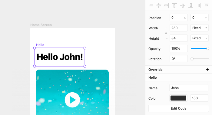
}Symbols provide overrides that allow you to pass custom data into them. Components have props that let you do the same thing:
import * as React from "react"
import { addPropertyControls, ControlType } from "framer"
// Creates the `Hello` component with a `name` prop.
export function Hello({ name, color }) {
  return <h1 style={{ color }}>Hello {name}!</h1>
}

// Defines the default value for the `name` prop.
Hello.defaultProps = {
  name: "World",
}

// Adds a control to override `name` and `color`.
addPropertyControls(Hello, {
  name: { type: ControlType.String, title: "Name" },
  color: { type: ControlType.Color, title: "Color" },
})
So code components can do the same things as design components, but that’s just the beginning. Next, let’s look at how you can use code components to create interactivity.
Harnessing the power of code components
With code components, you can create many interactions that aren’t possible with design components. Essentially, they enable you to use the full power of the web in your designs.
In this example, you’ll make a simple password component with validation. First, let’s start with the basics and set up the UI elements:
export function Password() {
  return (
    <div style={{ display: "grid", gridGap: "0.25rem" }}>
      <label>Password</label>
      <input type="password" placeholder="********" />
      <p style={{ color: "red" }}>Password must be at least 6 characters.</p>
    </div>
  )
}
Now you have a simple password field. Because it includes a standard input tag, it’s already able to accept text when you type.
Let’s add some controls so you can customize your password field.
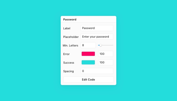
export function Password({
  label,
  placeholder,
  min,
  errorColor,
  successColor,
  gap,
}) {
  return (
    <div style={{ display: "grid", gridGap: gap }}>
      <label>{label}</label>
      <input type="password" placeholder={placeholder} />
      <p style={{ color: errorColor }}>
        Password must be at least 6 characters.
      </p>
    </div>
  )
}

Password.defaultProps = {
  label: "Password",
  placeholder: "Password",
  errorColor: "red",
  successColor: "green",
  gap: "0",
}

addPropertyControls(Password, {
  // The field label
  label: { type: ControlType.String, title: "Label" },
  // The placeholder value for the input
  placeholder: { type: ControlType.String, title: "Placeholder" },
  // The minimum password length
  min: { type: ControlType.Number, title: "Min. Letters" },
  // The color of the error message
  errorColor: { type: ControlType.Color, title: "Error" },
  // The color of the success message
  successColor: { type: ControlType.Color, title: "Success" },
  // The gap between elements
  gap: { type: ControlType.String, title: "Spacing" },
})
Using these props is fairly straightforward for all except min. Let’s add some logic to keep track of the input field’s value and compare it to min to conditionally show the error state. To do this, use the React function useState.
useState takes one parameter, which is the default value, and returns the current value and a function to update the current value.
const [myValue, setMyValue] = React.useState("My Default Value")To learn more about states, check out the official React documentation.
For this password component we’ll use two states: one to keep track of the password value as it changes and another to keep track of whether we should show the validations. In this case, we’re using onBlur so that the password will only be validated once the user leaves the field.
export function Password({
  label,
  placeholder,
  min,
  errorColor,
  successColor,
  gap,
}) {
  const [value, setValue] = React.useState("")
  const [showValidations, setShowValidations] = React.useState(false)
  // Checks the length of the password.
  const isTooShort = value.length < min
  return (
    <div style={{ display: "grid", gridGap: gap }}>
      <label>{label}</label>
      <input
        type="password"
        placeholder={placeholder}
        value={value}
        onChange={e => setValue(e.target.value)}
        onBlur={() => setShowValidations(true)}
      />
      {showValidations &&
        (isTooShort ? (
          <p style={{ color: errorColor }}>
            Password must be at least {min} characters.
          </p>
        ) : (
          <p style={{ color: successColor }}>Password is good!</p>
        ))}
    </div>
  )
}
Here’s what it looks like in action:
Our finished component
That’s it! You now have an interactive password component that validates input. There’s more you can add to this, if you like. For example, you can check to see if a password contains certain characters with value.match(...) or change the border color of the input based on error messages. With code components the possibilities are endless.
What’s next?
Using Framer’s API lets you integrate code components into your designs much more easily than with plain React components. This post shows you how to add controls to components using the Framer API, but there’s more to learn if you’re interested.
Check out the following resources to learn more about code components and React: